
TL;DR
Static contact forms often convert less than 3% of visitors, losing valuable leads. Using multi-step, personalized forms with clear next steps can triple conversions and turn more visitors into customers.
Imagine this: you pour money into ads, your landing page looks sharp, and traffic flows in. But then, visitors hit your contact form— and vanish. No inquiry, no message. It’s not your audience. It’s your form. That static, boring box where people have to fill in everything at once. It’s the final gatekeeper, and it’s often the reason your conversion rate is stuck in the mud. If you want more leads without spending another dollar on ads, it’s time to rethink your contact form. The secret isn’t more traffic. It’s smarter design. Let’s explore how to turn that silent killer into a lead-generating machine.
Key Takeaways
- Static contact forms typically convert less than 3% of visitors, leaving massive lead opportunities on the table.
- Switching to multi-step, personalized forms dramatically increases conversion rates—sometimes over 200%.
- Design tweaks like clear CTAs, progress indicators, and trust badges can boost form completions quickly.
- Reducing form length isn’t always better; relevance and user motivation matter more than just fewer fields.
- Modern form platforms like Delvasta make it easy to create engaging, mobile-friendly, automated lead funnels without a website rebuild.
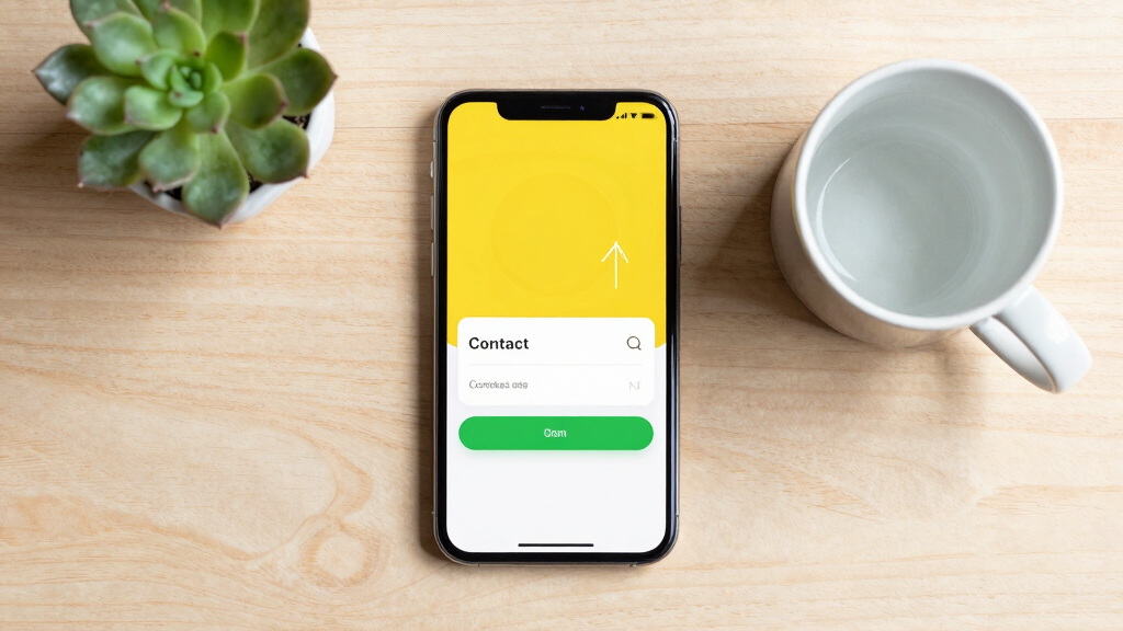
multi-step contact form builder
As an affiliate, we earn on qualifying purchases.
As an affiliate, we earn on qualifying purchases.
Why Your Contact Form Is the Silent Killer of Your Sales
Most contact forms are stuck in the past. They ask for everything upfront—name, email, phone, message—like a digital version of handing over a resume. But most visitors view these forms as barriers. They see a wall of fields and decide, “Not today.” This is critical because each additional required field increases friction, which directly correlates with abandonment rates. When visitors encounter lengthy, intimidating forms, they often choose to leave rather than invest time. According to research, only about 38% of users who interact with a contact form actually submit their details[6]. This low submission rate means you’re losing over 60% of potential leads right at the gate. The implications are clear: a static, lengthy form not only reduces your immediate conversions but also discourages repeat visits, as visitors associate your brand with inconvenience. If your form is bland, lengthy, or confusing, you’re losing money every day. The real danger lies in the silent attrition—visitors never even start filling out your form because it feels like a chore or a hurdle.
Take a real-world example: a SaaS company increased their lead conversions by 150% just by simplifying their form and adding a progress bar. This demonstrates that small tweaks, which reduce perceived effort and increase clarity, can have outsized impacts on your bottom line. The key takeaway is that static forms fail because they ignore human psychology: people want quick, relevant interactions, not a test of endurance. By understanding this, you can design forms that align with natural user behaviors, minimizing abandonment and maximizing lead capture.
personalized lead capture forms
As an affiliate, we earn on qualifying purchases.
As an affiliate, we earn on qualifying purchases.
The 5 Biggest Reasons Static Forms Fail (And How to Fix Them)
Static forms ask for too much at once, look generic, and ignore mobile users. Here’s why they fail—and what you can do about it:
- Too many fields at once: Overloading visitors with 10+ questions causes high abandonment. Fix: Break the form into bite-sized steps. This reduces cognitive load, making the process feel less daunting and more manageable. It also allows you to prioritize questions, asking only what’s necessary upfront and deferring less critical ones. This approach respects the visitor’s time and attention, increasing the likelihood of completion. However, tradeoffs include potential complexity in form design and the need for more sophisticated backend logic to handle multi-step processes.
- Uninspiring design: A plain form signals mediocrity. Fix: Add branding, progress indicators, and smooth transitions. A well-designed form builds trust; it reassures visitors that their data is safe and that your business is professional. Visual cues like progress bars motivate users to complete the process, reducing drop-offs. Smooth animations and clear layout guide the eye naturally, making the experience feel intuitive. The tradeoff is that over-designing can distract or slow users if not done carefully, so balance is key.
- Ignoring mobile: Tiny input boxes and horizontal scrolling kill mobile usability. Fix: Use mobile-first design and larger tap targets. Mobile users are often in a hurry or multitasking, so making forms easy to navigate on small screens is crucial. Larger buttons, ample spacing, and simplified input fields reduce frustration and errors. Neglecting mobile optimization risks alienating a significant portion of your audience, leading to lost leads. The tradeoff here involves ensuring desktop versions remain sleek while optimizing for mobile, which may require additional development effort.
- Collecting data without qualifying: Every visitor gets the same treatment. Fix: Use conditional logic to tailor questions. This makes the form more relevant and engaging, as visitors only see questions that matter to their situation. It reduces frustration and increases the chance of completion by avoiding irrelevant or repetitive questions. The tradeoffs include increased complexity in form setup and potential confusion if logic isn’t implemented correctly, which could frustrate users.
- No feedback or next steps: Submit button feels like a dead end. Fix: End with a clear next action—book a call, download, or view results. Providing immediate, relevant feedback reassures visitors that their effort was worthwhile. Clear instructions or incentives, such as “Get Your Free Quote” or “Schedule a Call,” set expectations and motivate completion. Without this, users may feel unsure about what happens next, decreasing trust and conversion rates. The tradeoff is ensuring that the follow-up process is seamless and aligned with user expectations, which may require backend automation or integrations.
For example, a financial advisor’s form that used to have 8 fields was replaced with a 3-step quiz, increasing submissions by 214%. This illustrates that thoughtful redesign can turn a passive barrier into an active conversion tool, emphasizing the importance of understanding user psychology and behavior in form design.
mobile-friendly contact form platform
As an affiliate, we earn on qualifying purchases.
As an affiliate, we earn on qualifying purchases.
Frequently Asked Questions
How many fields should my contact form have?
Focus on relevance. Usually, 3-5 well-chosen fields are enough to qualify leads without overwhelming visitors. Use conditional logic to ask more only if needed.
Why do people abandon contact forms specifically?
People abandon forms due to length, complexity, lack of trust, or poor mobile experience. Making the form simpler, faster, and more trustworthy reduces abandonment.
Does reducing fields always improve conversions?
Not always. While shorter forms generally perform better, removing irrelevant fields and adding relevance through personalization can improve quality and quantity simultaneously.
What fields are most likely to cause abandonment?
Phone numbers and email fields often see high drop-off rates. Optional or conditional questions on these fields can reduce friction.
How can I redesign my form without losing qualified leads?
Use multi-step forms with scoring and conditional logic. Test frequently, analyze drop-off points, and continuously refine for better results.
form progress indicator plugin
As an affiliate, we earn on qualifying purchases.
As an affiliate, we earn on qualifying purchases.
Conclusion
Your contact form isn’t just a form. It’s the final handshake, the last impression, and your best chance to turn visitors into leads. Upgrading it isn’t complicated, but ignoring it costs you thousands in missed opportunities. Treat your form as a conversion tool—because it is.